



Last Recordings On Earth
Identity, art direction, and a website for an independent record label — built around a red dot that never stops recording.
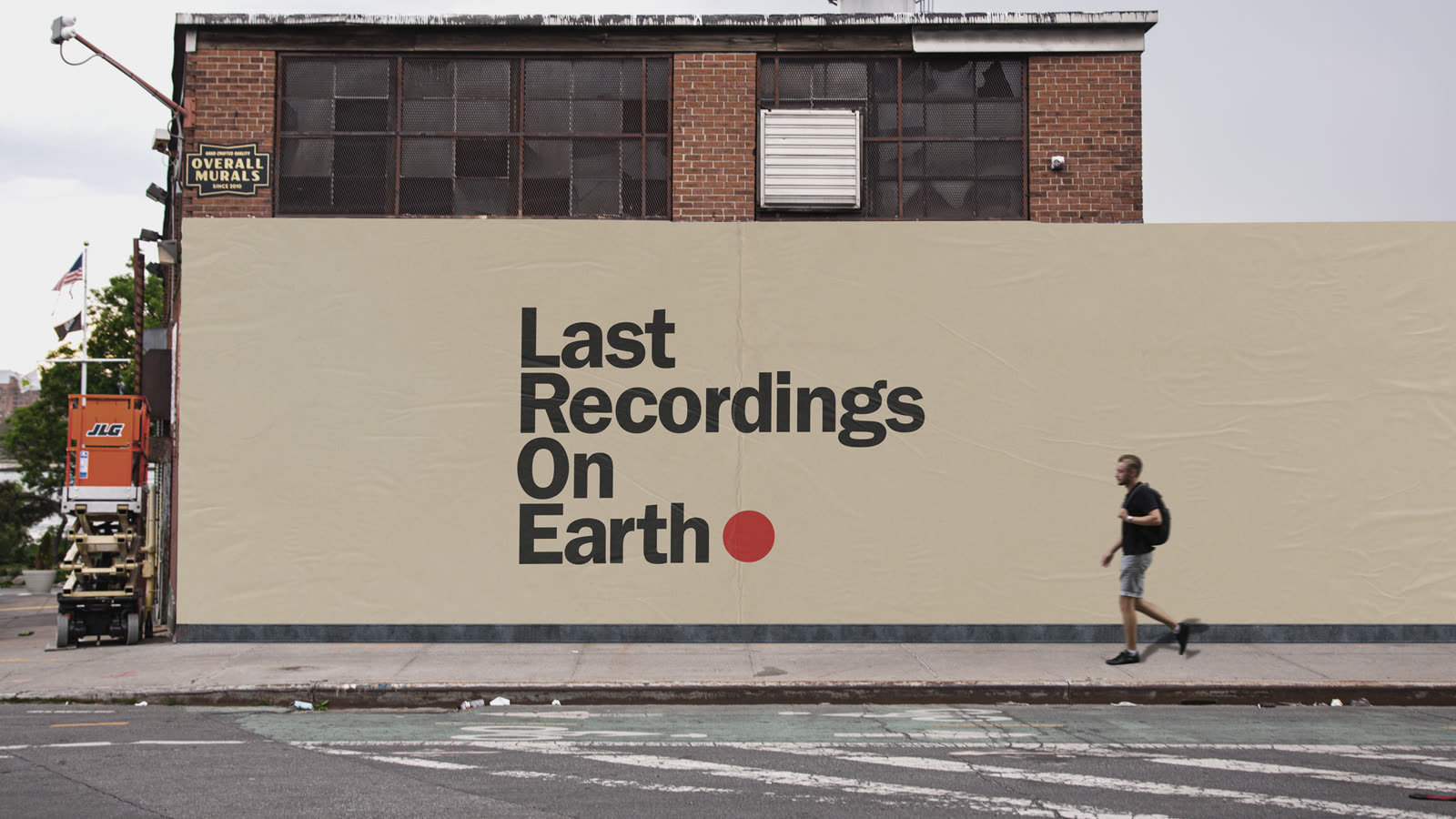
The name does a lot of work on its own, so the identity stays out of its way: a heavyweight grotesk lockup, kraft-paper and putty grounds, and a single red dot — the recording light, always on. Big enough to wheat-paste across a building; small enough to press onto a screen like a sticker.
THE WORK
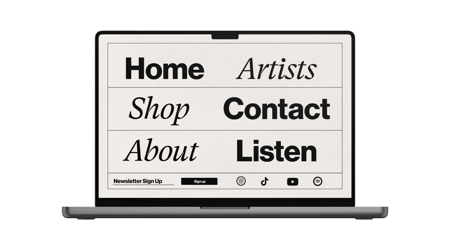
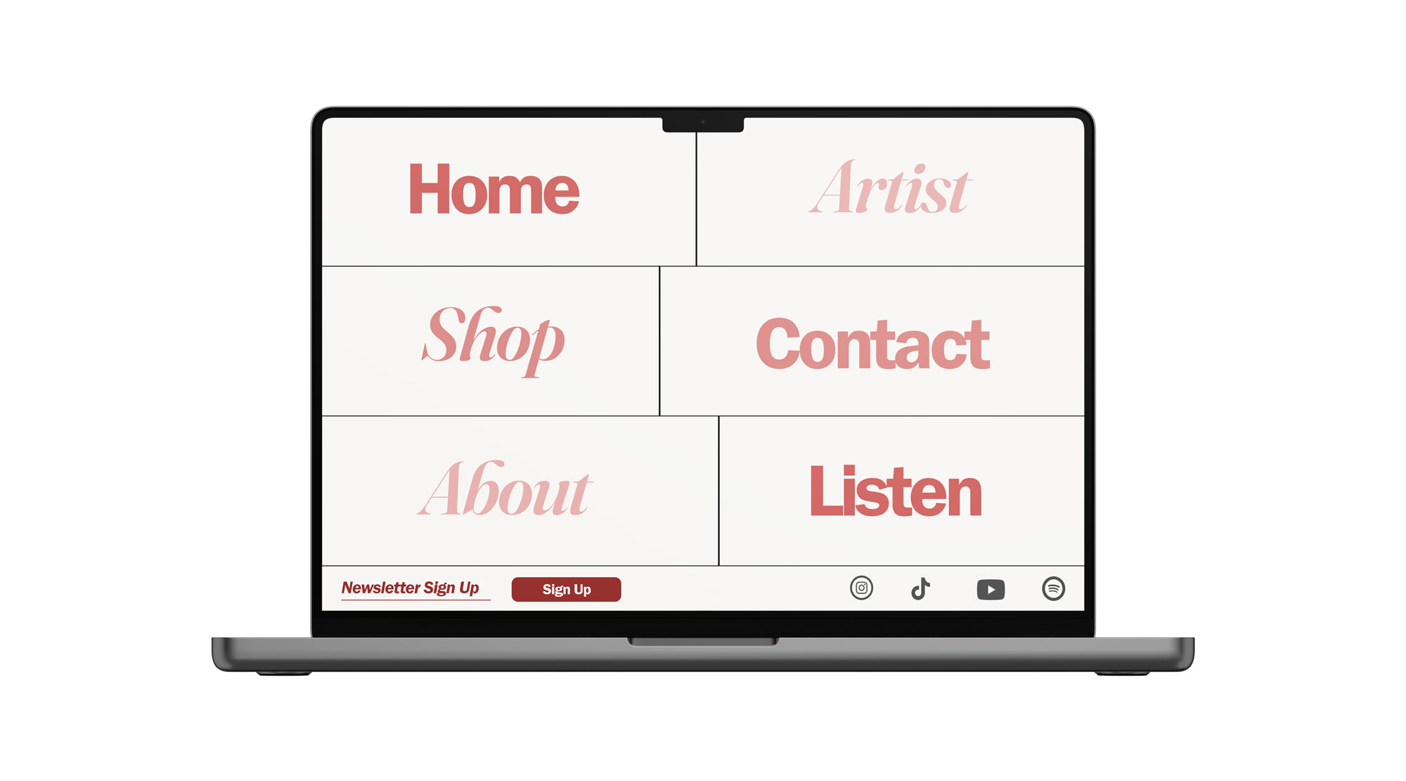
The system runs on one tension: bold grotesk against italic serif, statement against aside. The website turns that into navigation — a full-screen editorial table where Home, Artists, Shop and Listen alternate voices like a conversation, with a newsletter strip and platform icons kept to a single quiet row underneath. It ships in two temperatures: a mono putty version and one soaked in label red.
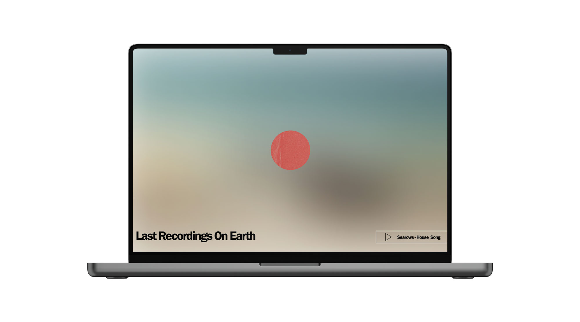
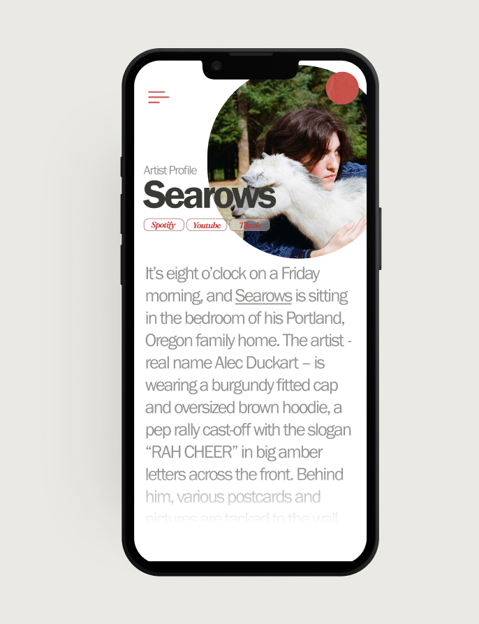
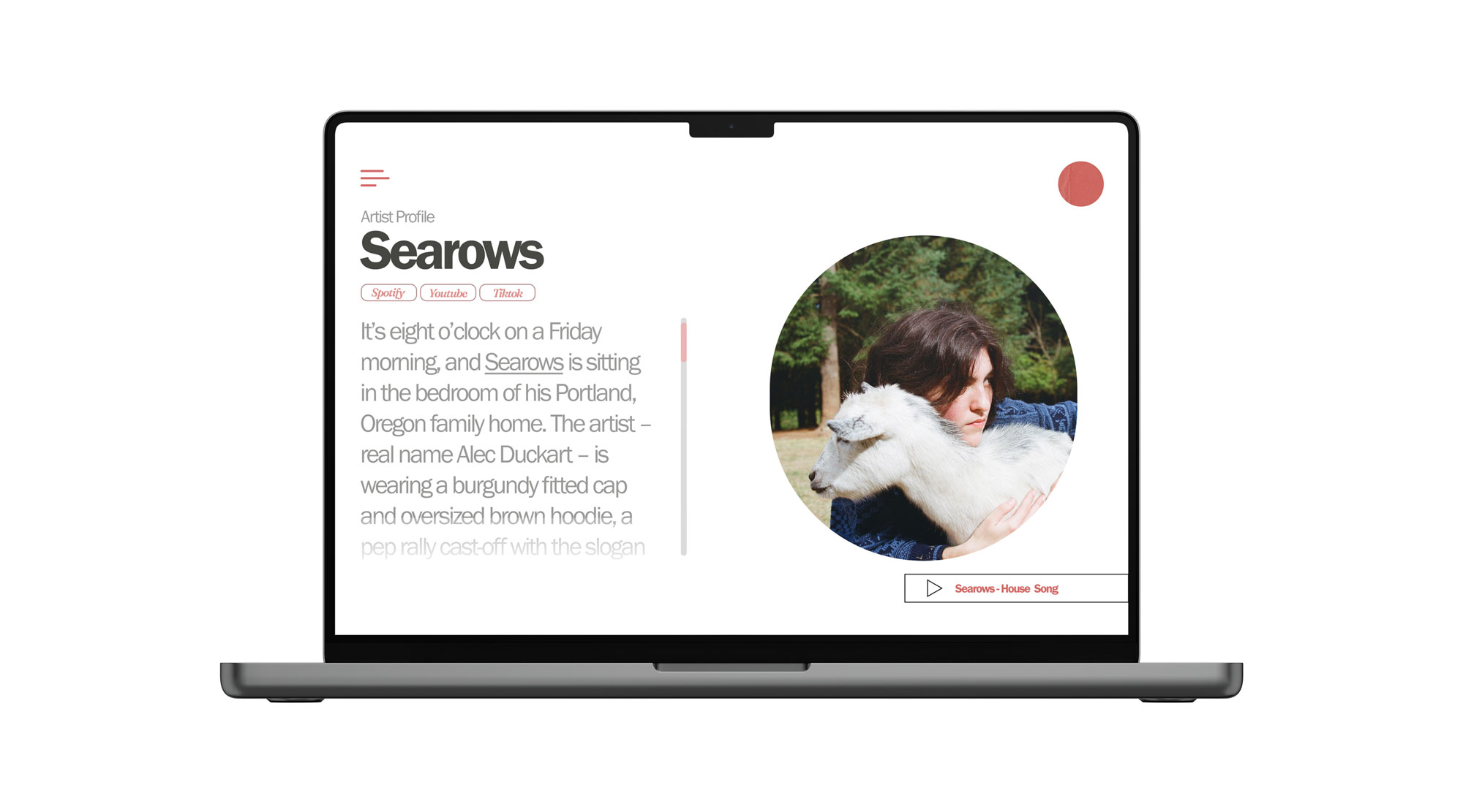
The splash strips everything back to a blurred coastline, the dot in the middle, and a persistent player pinned to the corner — whatever the label wants you hearing that week. Artist pages read like magazine profiles instead of streaming-service cards: circular portrait, longform bio, platform chips, built mobile-first for a roster of quiet songwriters like Searows.
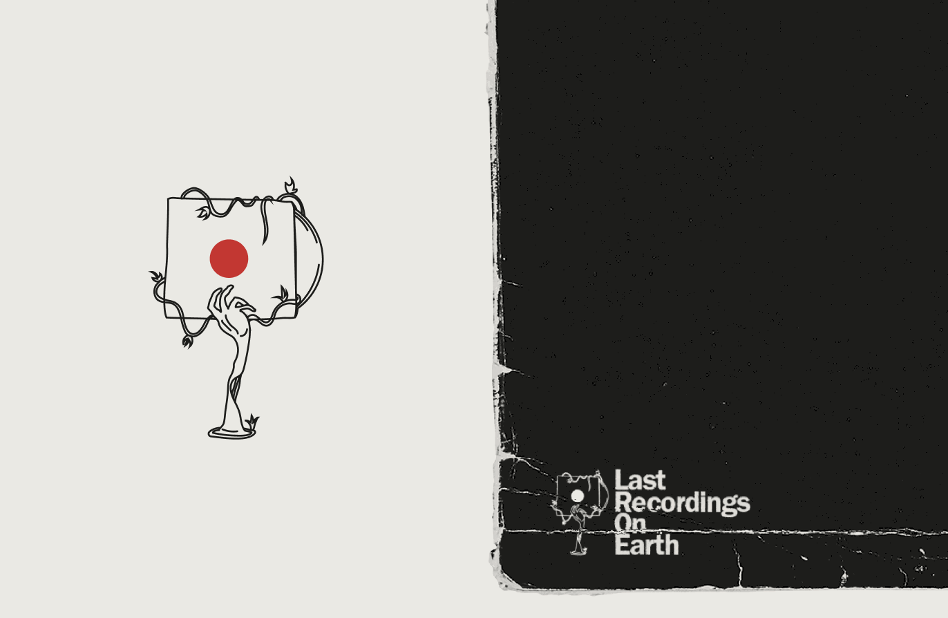
The rest of the identity moves. A line-drawn stamp — a hand grown from vines holding a sleeve — loops as the label's mark of authenticity, the dot pulses on its own, and the release artwork keeps the restraint: songs for the end of thyme sets white grotesk over a botanical silhouette on label red, a whole record in two colours.