
Matt Maltese
Creative direction, art direction, and design for the London songwriter's records — a collaboration that started with his debut and never stopped.
Matt Maltese writes love songs for the end of the world — wry, tender, very British. The records needed artwork that could hold that tone: domestic scenes played dead straight, type that never winks, and a different colour of melancholy for every release.
THE WORK
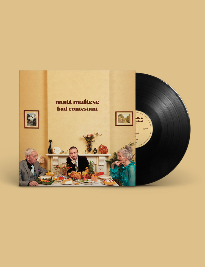
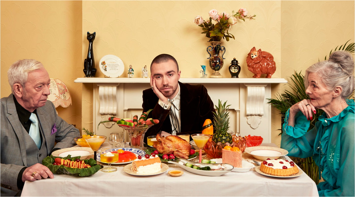
It started with Bad Contestant, Matt's debut album — brand building and art direction from the ground up, landing on a dinner-table tableau on a warm custard ground, equal parts sitcom and still life. That record set the visual register for everything after it, and I've worked on the artwork with him for the rest of his projects since.
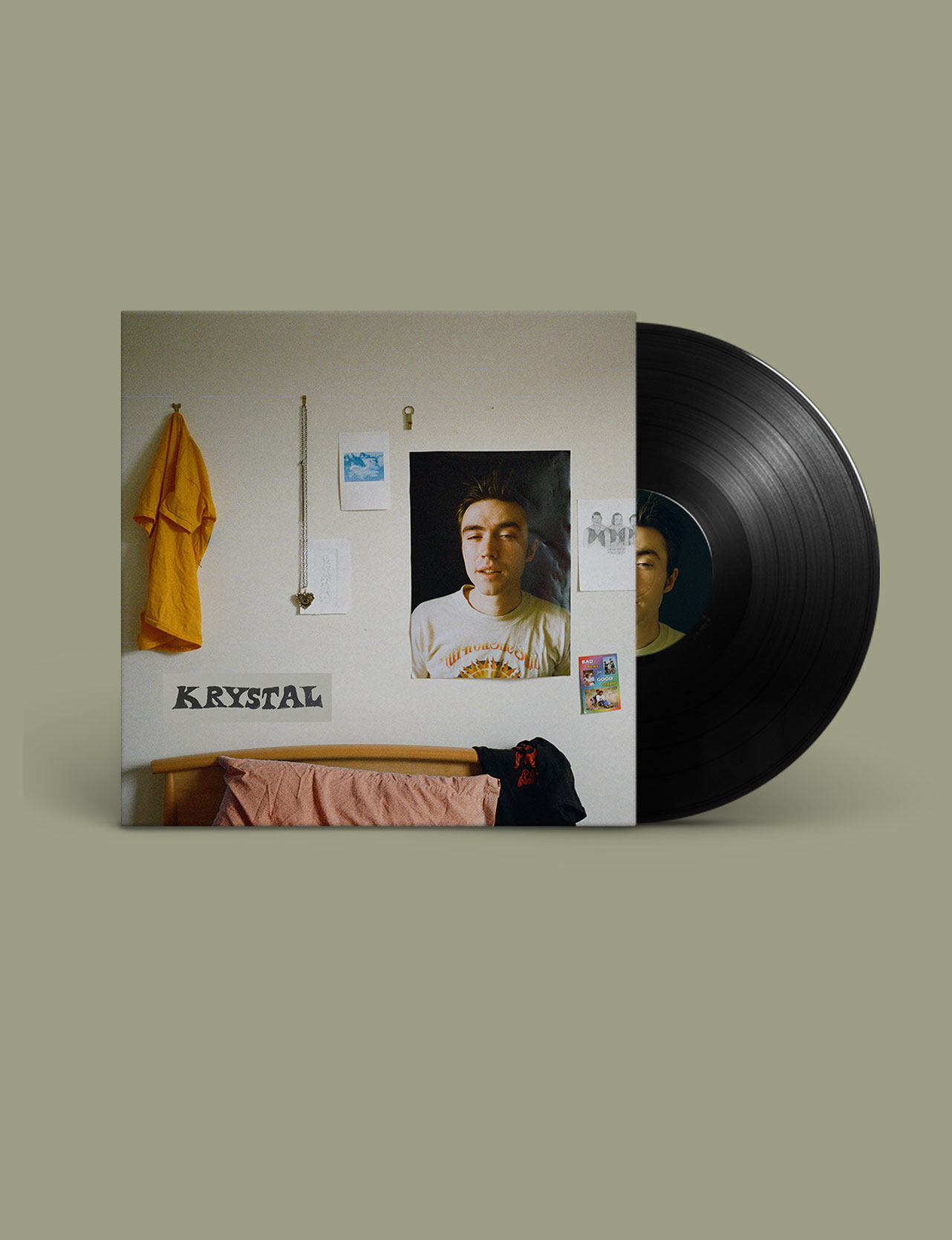
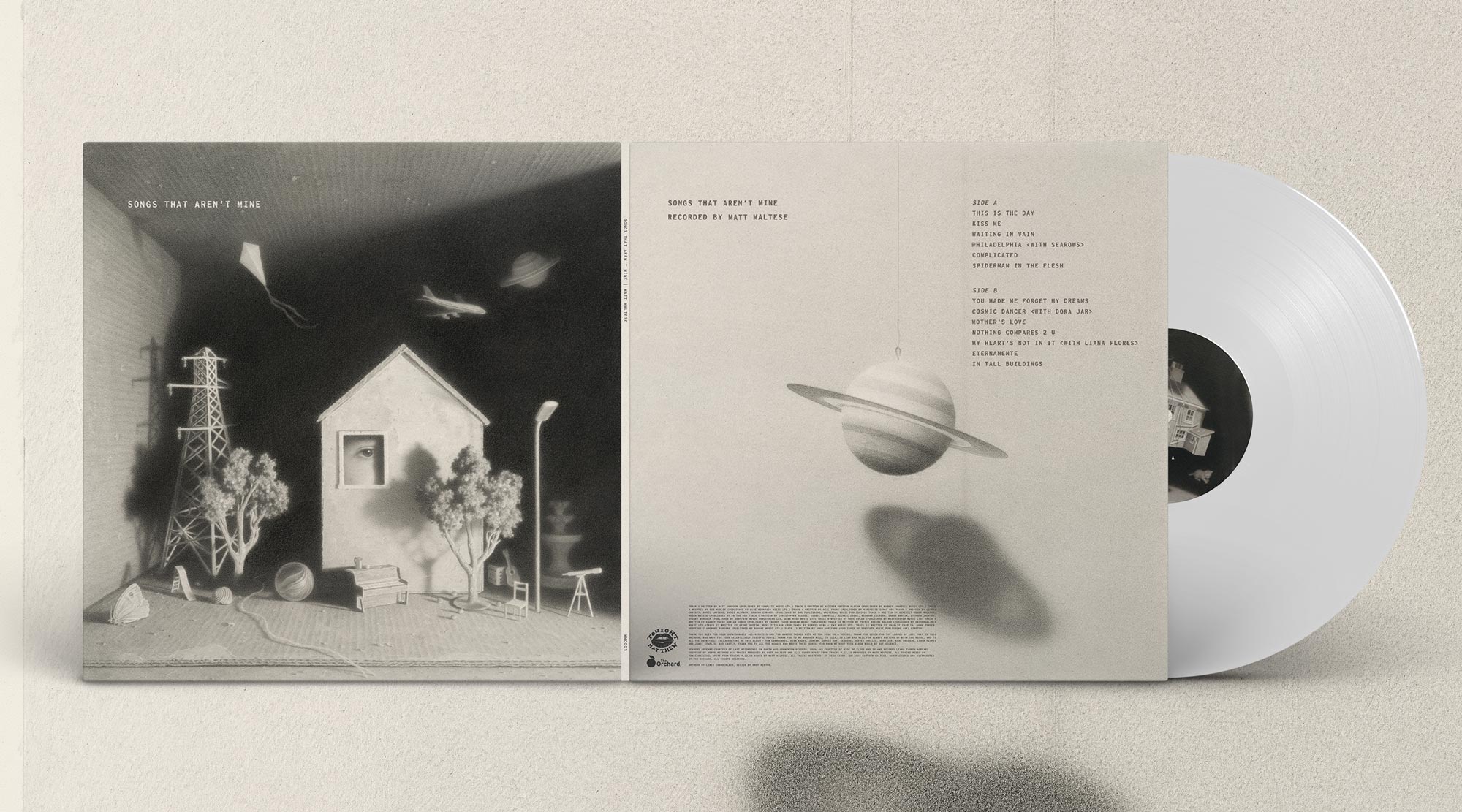
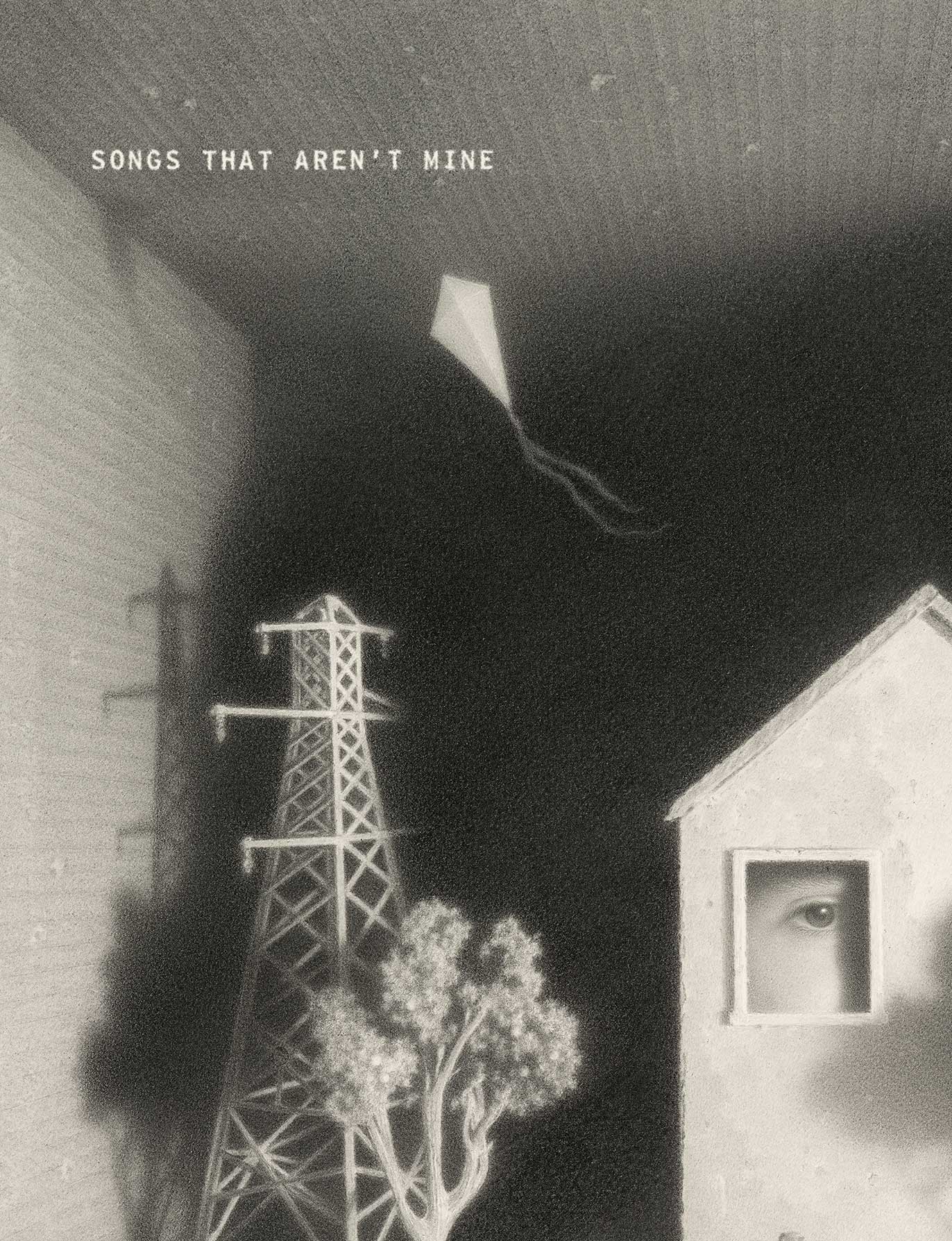
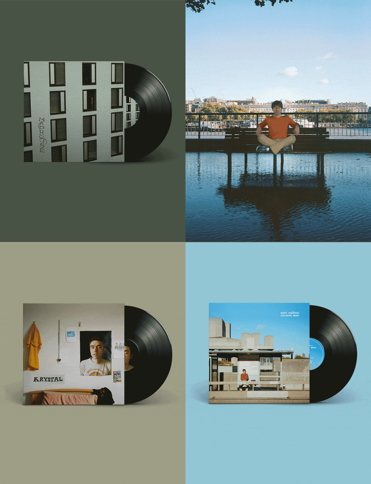
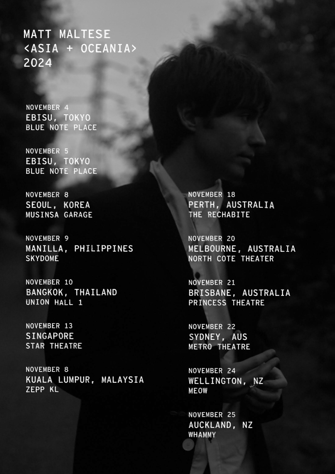
Krystal moved to the bedroom wall, all snapshots and sticky tape on sage. Madhouse turned an apartment block into a sleeve, the record sliding out of a window-grid facade. Songs That Aren't Mine, the covers record, went monochrome: a miniature house at night, a pylon, a kite — a model village dream pressed on white vinyl, with a typewritten tracklist running up the back at an angle. The same mono voice carries the 2024 Asia and Oceania tour poster, dates set in terminal type over a dusk portrait.
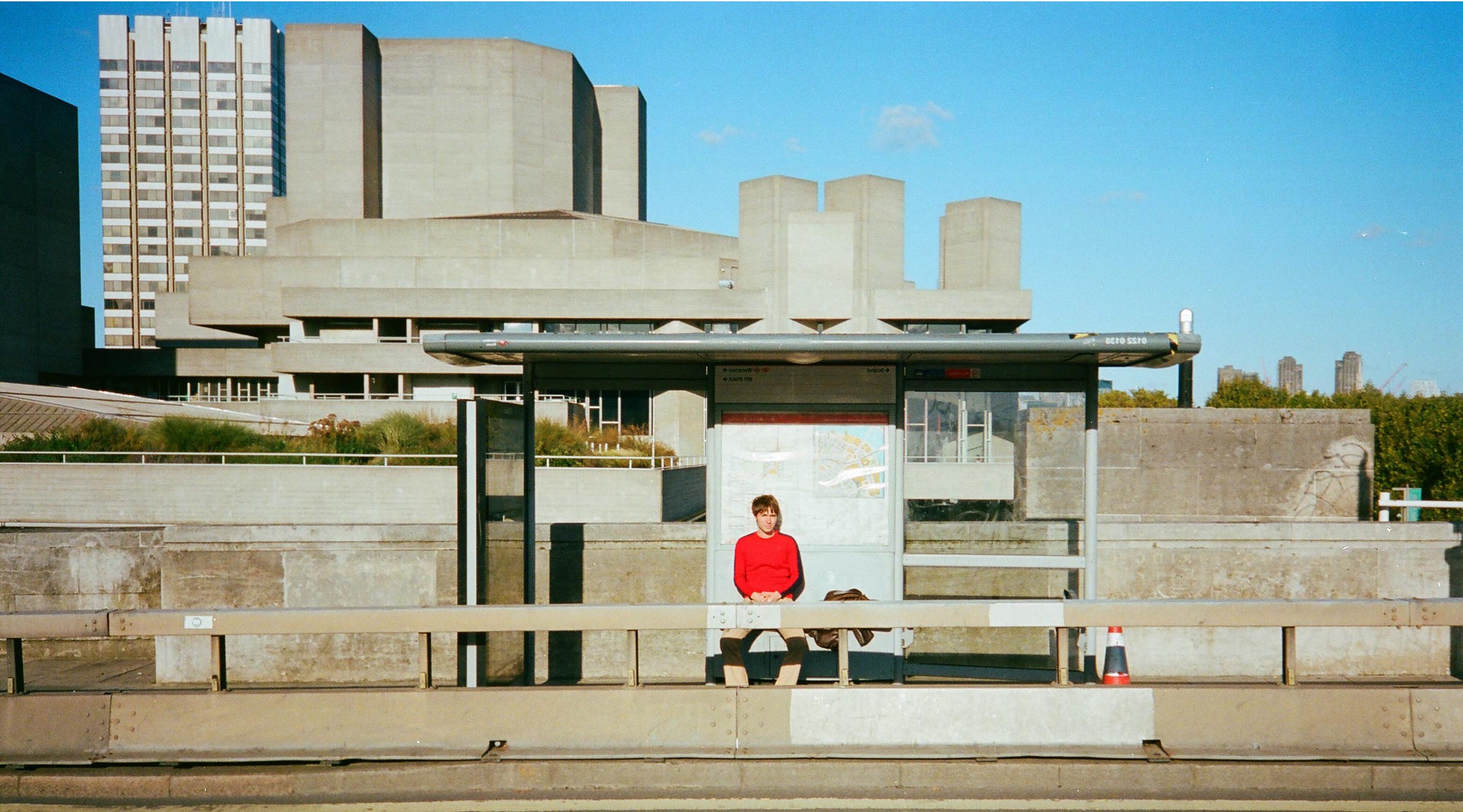
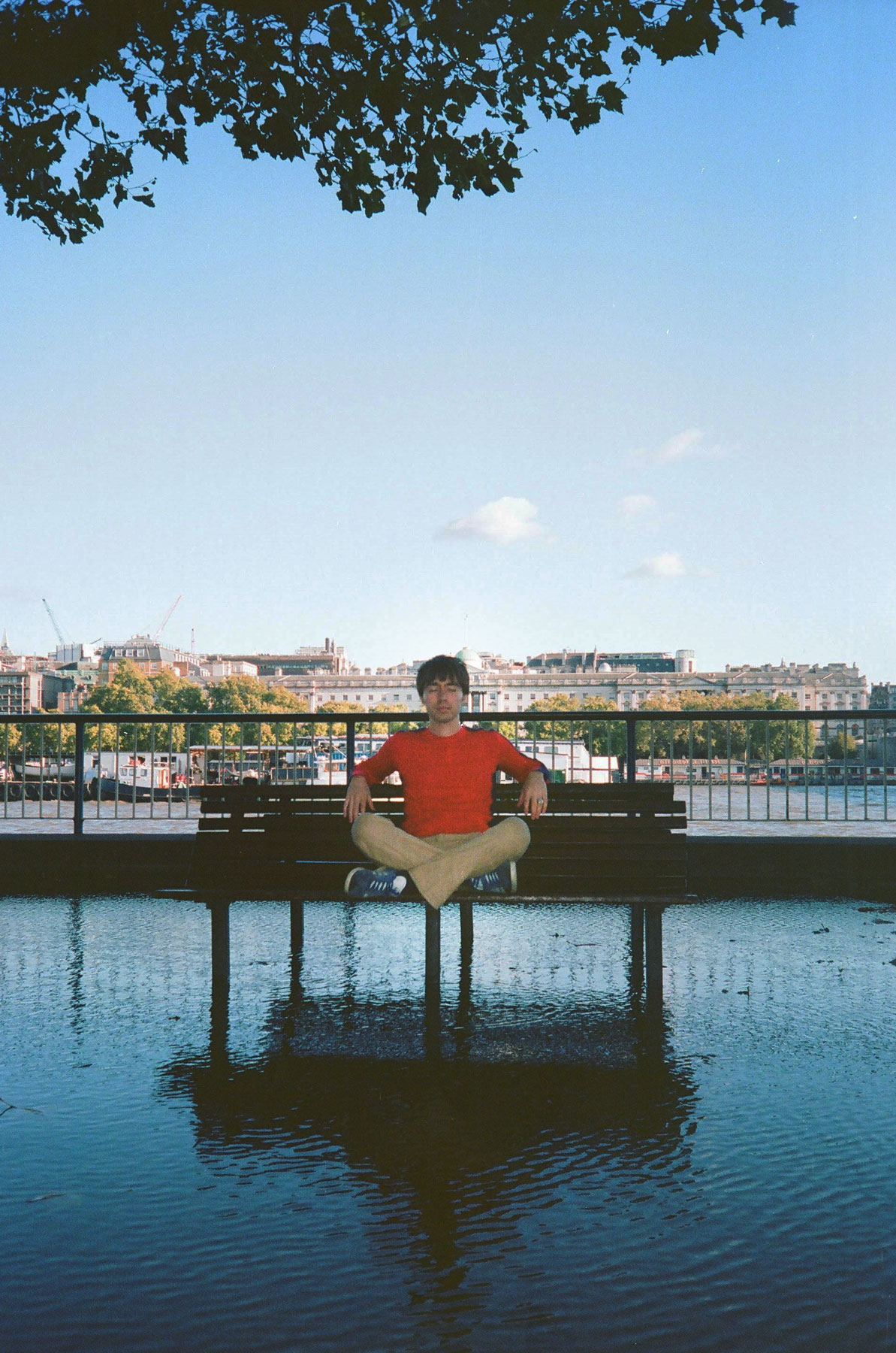
The backdrops — bus stops, park benches, brutalist concrete under blue sky — are all London, because that's where we were mostly collaborating. The city the songs live in is the city the artwork was made in, and the identity keeps returning to it.